


February 16, 2026
How Are Corporate Logos Made? The Meanings Embedded in Logo Marks
How are corporate logo marks created? The meanings and intentions behind them
The logos you casually see every day hide a company's "intent" in their colors and shapes. Here are some behind-the-logo stories you'll want to tell someone--surprising meanings and episodes like, "Wait, that company's logo has that backstory?"
Secrets hidden in corporate logos
Even the most familiar corporate logos conceal unexpected secrets.
Let's look at little-known stories behind logos you see all the time.
Asahi Group Holdings, Ltd.
Speaking of the Asahi Group, it's a company that has Asahi Breweries, Asahi Soft Drinks, and Asahi Group Foods under its umbrella. I've personally been familiar with their products since childhood -- from Mitsuya Cider to Calpis, the Asahi Group's brands have long been a part of my life.
Did you know the Asahi Group logo underwent a major redesign in April 2024?
As of 2025, Asahi Group has a 136-year history, and over half of its employees now work overseas. As the company evolves from a "Japanese company" to a "global company," the new logo incorporates some clever ideas (Figure 1). *1
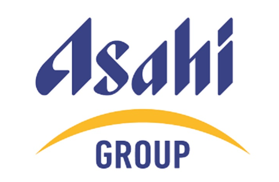
Figure 1: Asahi Group logo
Source: Asahi Group Holdings, "Formulation of New Group Corporate Logomark and Corporate Statement"
https://www.asahigroup-holdings.com/en/newsroom/detail/20240305-0201.html
The first eye-catcher is the yellow "Sunrise Arc" added beneath the word "Asahi." It literally evokes the morning sun and is designed so that people worldwide--who may not know the Japanese word asahi--can intuitively associate it with "morning sun = light."
The blue-and-yellow palette also carries meaning. While expressing earth and sun, water and light, it embodies elements such as "tradition and innovation," "sincerity and passion," and "trust and challenge." *1
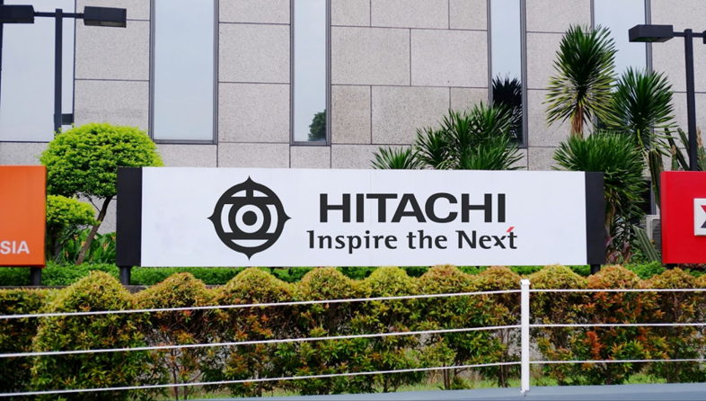
Hitachi, Ltd.
Hitachi's logo carries a deep story rooted in long history.
At the company's founding in 1910, first president Namihei Odaira believed that "to create fine products and earn the public's trust, an original mark is essential." He created the "Kame-no-kou" mark (Hitachi mark) by himself, which overlays the characters for "sun" (日) and "stand" (立), as shown in Figure 2. The small outer protrusions represent the sun's rays, expressing the founding spirit of "standing with the sun."
As Hitachi grew into a global electronics manufacturer, its logo evolved. In 1980, the company established a unified emblem to standardize its image. In 1991, it adopted an English "HITACHI" logo for global expansion, limiting the original Kame-no-kou mark to use as the company emblem.
Since 2000, the logo has included the message "Inspire the Next," meaning "to continually breathe new life into the next era." The red line at the upper right symbolizes Hitachi's drive to keep growing, its strong will to move into a new age, and the passion to inspire the future--with that same meaning embedded in the tagline itself.
As of the end of March 2024, the Hitachi Group had 268,655 employees, exceeding the population of Tokyo's Minato Ward (267,780 people). The founding philosophy--"contributing to society through technology"--continues to be passed down along with the logo. *2, *3, *4, *5
Note: The Minato Ward population figure is as of January 1, 2025.

Figure 2: Evolution of the Hitachi logo
Source: The Institute of Electrical Engineers of Japan, History of Electrical Engineering No. 40, p.4
http://www2.iee.or.jp/~fms/tech_a/ahee/newsletters/pdf/n40.pdf
NS Tool Co., Ltd.
Lastly, our company, "NS Tool Co., Ltd.
NS Tool's logo uses the cutting edge of an end mill to express a strong will to carve open the future of manufacturing (Figure 3). *6
Figure 3: NS Tool logo
Source: NS Tool Co., Ltd., "NS Tool Co., Ltd."
https://www.ns-tool.com/en/
We are a leading manufacturer of metalworking tools, specializing in precision cutting tools known as solid carbide small-diameter end mills. Our advanced technology supports the production of precision components for devices such as smartphones, contributing to products that are part of people's daily lives.
An "end mill is, simply put, "a tool for cutting metal." Our specialty is carbide small-diameter end mills with tip diameters of 6 mm or less. *6
Among end mills is the ultra-micro machining line "Micro Edge." Remarkably, the smallest tool diameter is 0.01 mm, fine enough to engrave letters on a strand of hair (Figure 4). *7
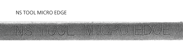
Figure 4: Letters engraved on a hair
Source: NS Tool Co., Ltd., "Micro Edge Development Story"
https://www.ns-tool.com/en/company/microedge/
With the introduction of the Micro Edge series, many companies have been able to take on the challenge of micro machining.
These tiny tools make it possible to manufacture a wide range of products that support our daily lives. *6, *7
Can sound be a logo? What is a sound logo?
When you hear "logo," you probably think of the "marks" introduced above.
But in TV and radio commercials or online videos, are there sounds or melodies that instantly make you think of a certain company? In fact, that sound can be a logo too.
For example, there's the famous jingle for a certain salt brand that almost everyone in Japan has heard at least once. Just seeing the syllables "Ha-ka-ta-no-shio♪" probably triggers the melody in your head. That sound logo was born in 1987 and has helped raise recognition of Hakata no Shio. For a long time, the composer and voice behind the sound logo were unknown; In 2023, it was revealed that the composer was Hironobu Urata (浦田博信) and that the original voice actor was musician Nobuhiro Shiotani (塩谷信廣).--a surprising episode. *8
It's amazing that such a famous sound logo had unidentified credits for 36 years.
Sound logos enhance impressions of a company or brand. Advertising research has found something interesting:
hearing the same melody repeatedly creates a sense of reassurance toward the product or brand and increases favorability--and if the melody is friendly and approachable, the effect is even stronger. Adding melody also makes company names and taglines easier to remember; many of us have felt that words stick better when paired with a tune. *9
No wonder that "Ha-ka-ta-no-shio♪" melody has been loved for 36 years.
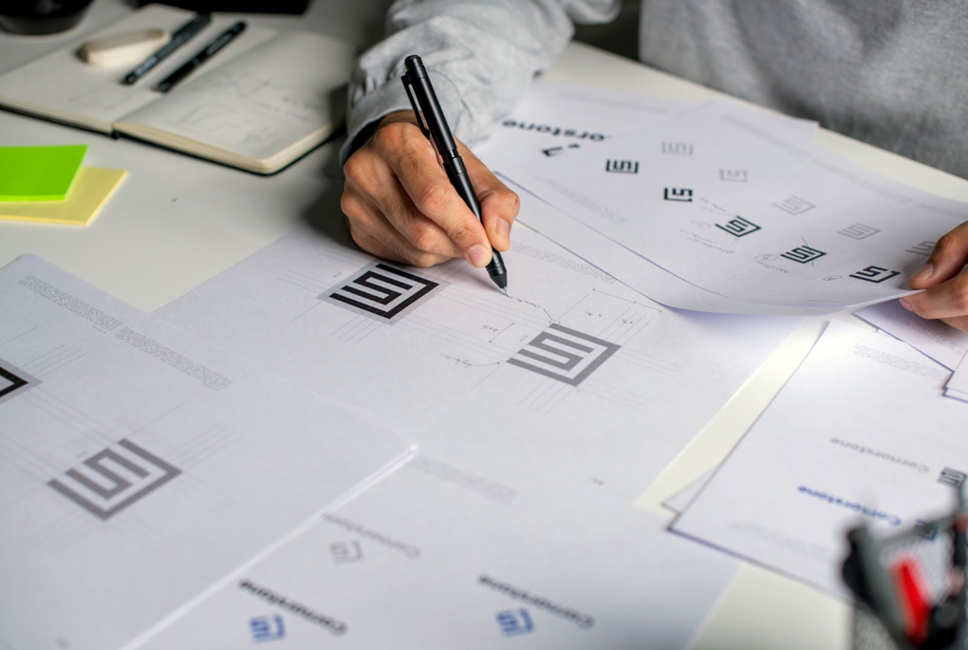
Idea techniques for creating logos
Turning a logo into form is tough. Here are tips for developing the ideas in your head into concrete logo designs. *10
Consider your ideation approach
First, clarify what you want to communicate. Pick a few keywords that express your company's personality--"trust," "innovation," "friendliness," etc.
Once you've narrowed your keywords, approach the design with these three methods:
●Elimination (淘汰)
Minimal designs that pare away the unnecessary are a classic of logo work. By organizing information and projecting refinement, they convey reliability and solidity.
●Wit & Polish (洒脱)
Memorable designs--unique typefaces, vivid color, small visual twists--appeal to emotions like impulse and feeling.
●Philosophy (思想)
Logos that reflect corporate philosophy or brand image evoke strong empathy. By harmonizing type, color, and form within a coherent world, you can clearly express qualities like "traditional" or "cutting-edge."
Draw inspiration from your industry
Logo colors and shapes often reflect industry-specific imagery. For instance, food companies frequently use warm colors like red and orange to stimulate appetite and create friendliness.
Using pictograms can also be effective.
A pictogram is a symbol that conveys information through images. At the Tokyo 2020 Olympic and Paralympic Games, the sport pictograms drew attention--designed so that you can instantly tell the sport from the motion and equipment (Figure 5). *11, *12
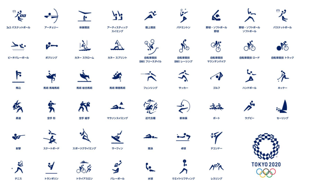
Figure 5: Tokyo 2020 sports pictograms
Source: Ministry of Education, Culture, Sports, Science and Technology (MEXT), "Tokyo 2020 Olympic Sports Pictograms"
https://www.mext.go.jp/sports/content/20220331-spt_oripara-000018028_18-1.pdf
Start from letters and shapes
As a starting point, focus on the letters of the company or brand name. Emphasizing the initial or using it as a motif for a symbol mark can highlight the brand's individuality.
You can also incorporate shapes or illustrations into the logo; adopting a character as a logo is another approach.
You might see logos differently starting tomorrow
There are countless intriguing logos hidden all around us.
Take convenience store signs, for example. Their colors and design surely embody each company's personality and intent. Imagining the "other side" of a logo will reveal a brand story and corporate appeal you hadn't noticed. A corporate logo isn't just a mark--it's the company's soul made visible.
Shall we hunt for the messages that companies and brands have sprinkled throughout the city?
References & Citations
*1 Source: Asahi Group Holdings, "Formulation of New Group Corporate Logomark and Corporate Statement"
https://www.asahigroup-holdings.com/en/newsroom/detail/20240305-0201.html
*2 Source: The Institute of Electrical Engineers of Japan, History of Electrical Engineering No. 40, p.4
http://www2.iee.or.jp/~fms/tech_a/ahee/newsletters/pdf/n40.pdf
*3 Source: Hitachi, Ltd., "R&D and Intellectual Property Report 2008," p.21
https://www.hitachi.co.jp/ICSFiles/afieldfile/2008/06/13/chizaihokoku2008_8.pdf
*4 Source: Hitachi, Ltd., "Company Overview"
https://www.hitachi.com/en/about/hitachi/
*5 Source: Minato City, "Population and Number of Households as of January 1 Each Year (1954-2025)"
https://www.city.minato.tokyo.jp/toukeichousa/kuse/toke/jinko/kako/kako.html
*6 Source: Nippon Bell Investment Research Institute, "6157 NS Tool," pp.3-4
https://www.belletk.com/niltusinnkougu202411.pdf
*7 Source: NS Tool Co., Ltd., "Micro Edge Development Story"
https://www.ns-tool.com/en/company/microedge/
*8 Source: Hakata Salt Co., Ltd., "Gallery Archive"
https://www.hakatanoshio.co.jp/movie/
*9 Source: Japanese Journal of Cognitive Psychology, "Effects of Repeated Presentation of Sound Logos and Melody Familiarity on Product Evaluation," Norihiro Matsuda, Takashi Kusumi, Tomei Yamada, Takeo Nishi, pp.10-11
https://www.jstage.jst.go.jp/article/jcogpsy/4/1/4_1_1/_pdf/-char/ja
*10 Source: Design Learning Series: The Big Book of Logo-Making Ideas, Hifumi Furuoka & Maniackers Design, pp.30, 34, 52
*11 Source: The Yomiuri Shimbun, "Olympics: Pictograms Show National Flavor... Tokyo Focuses on 'Clarity,' Paris on 'Chic'"
https://www.yomiuri.co.jp/olympic/2024/20240802-OYT1T50183/
*12 Source: MEXT, "Tokyo 2020 Olympic Sports Pictograms"
https://www.mext.go.jp/sports/content/20220331-spt_oripara-000018028_18-1.pdf
Pan Tanaka
Interested in the global environment and warming since student days; studied environmental science at university. Currently writes mainly on environmental and agricultural topics. Certified >Odor Judge; member of the Japan Association on Odor Environment.